Column: Whisky has a tradition problem - and it’s time to fix it
Best ofFriday, 31 July 2026 at 09:03
Never miss whisky news, reviews, and new releases again.
Add Whisky Monkeys as a Google favoriteIf you’ve walked through a liquor store lately, you may have noticed: more and more whisky brands are updating their bottles and packaging. Some changes are subtle, others impossible to miss. And of course, not everyone’s thrilled. Many seasoned whisky fans love those classic labels, and that’s fine, but if we want to excite a younger audience, the whisky world could stand to look a little more modern.
Whisky lovers cherish tradition. Old labels, hefty bottles, ornate lettering, and boxes that look like they’ve spent 150 years in a dusty warehouse. Change any of that and someone will say it was better in the old days. Maybe they’re right, but we can’t go back. So we move forward. As whisky drinkers, sure, but especially as whisky makers. That means it’s time to shake things up.
I don’t see that as a bad development at all.
More sustainable whisky packaging is a logical step
The main reason to rethink packaging is, of course, sustainability. Less glass, less cardboard, and materials that are easier to recycle. Hard to argue with that. A whisky bottle doesn’t need to be that heavy, and the glass certainly doesn’t need to be that thick. Nor does it need a massive box around it that goes straight into the recycling. Those are being slimmed down or scrapped altogether in the name of sustainability.
There’s another upside to going greener. Whisky brands are more or less forced to reassess their look. That’s a perfect opportunity to present themselves in a more contemporary way.
Glenfiddich suddenly looks a lot sharper
Take Glenfiddich. Almost everyone knows the name. Even people who never drink whisky will likely recognize the triangular bottle and the stag on the label.
The refreshed look may take a moment to get used to, but I think the result is much sleeker, though the old bottle was anything but dated. The new bottle is unmistakably Glenfiddich, just more modern and clean.
To me, that’s exactly how you should update a whisky brand. You don’t have to toss out everything people recognize. Let the history show, but add a little polish, it never hurts.
Tradition and modernization can coexist just fine. Distilleries do it themselves when making our favorite spirit.
Highland Park leaves the Vikings behind
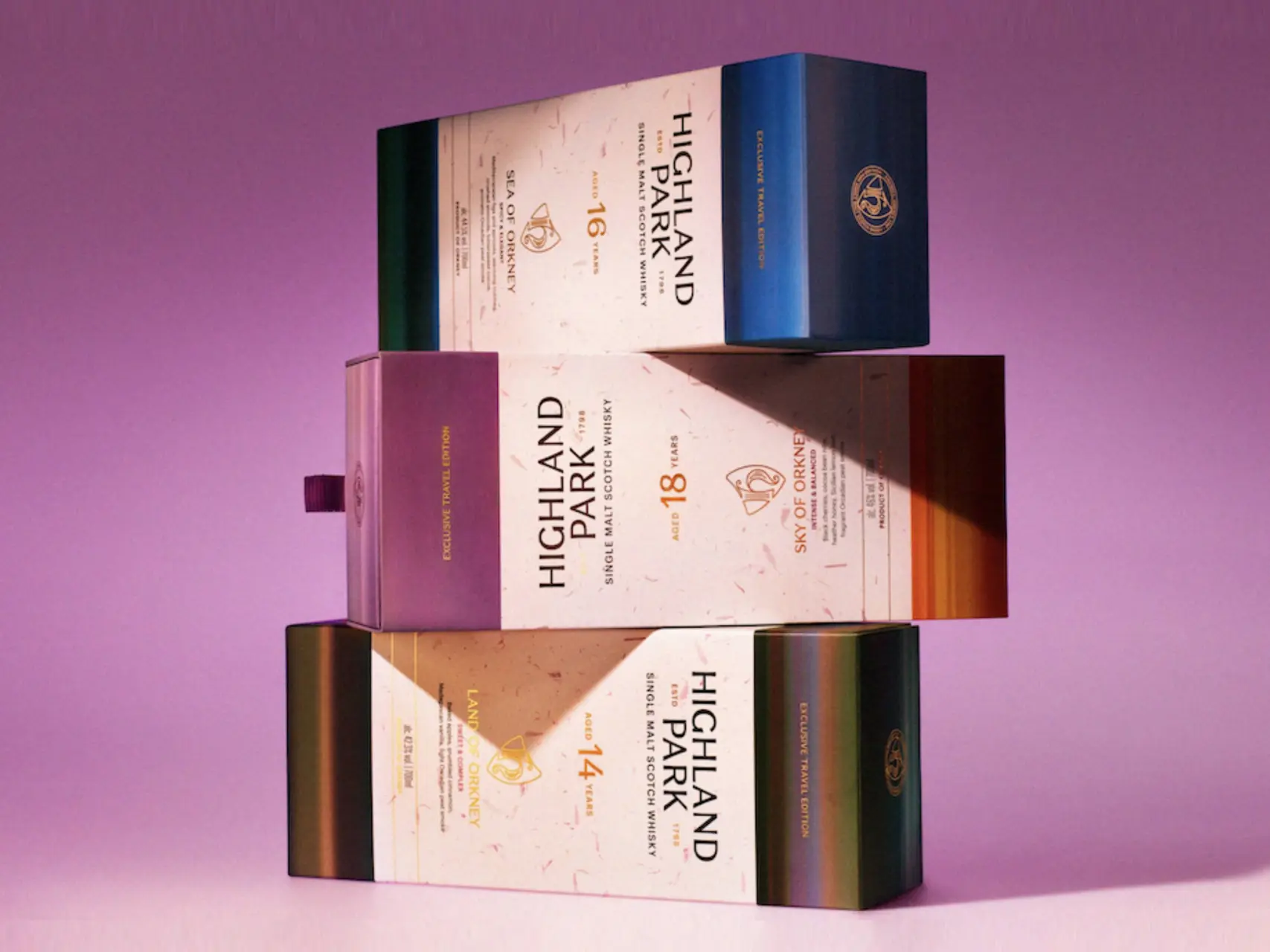
Highland Park has also overhauled its packaging. For years the brand leaned heavily on Vikings, Norse mythology, and tough-sounding names. That fit Orkney’s history, of course, but at some point it became a bit much.
The new packaging is more neutral. Less shouty, maybe even calmer. Yet the bottle, to me, actually feels more Orkney—and there’s plenty of tradition and heritage on display before the first drop touches your lips.
I think that’s a smart move. Orkney is fascinating enough on its own, with its wild weather and heathery landscape. It’s also a savvy refresh to attract a new generation of whisky drinkers.

A new generation chooses with its eyes first
Changes like these are exactly what the whisky world needs to bring in new audiences. Especially now, when we meet people by swiping right and first impressions often trump conversation. People buy what they already know or what catches their eye.
If you grew up seeing Glenfiddich, Johnnie Walker, or Jameson at home, you’re more likely to reach for those brands again in the store. And when people do discover something new, it’s usually thanks to a recommendation or their eyes.
That last part is often underestimated. Of course, it ultimately comes down to the whisky in the bottle. A stunning label won’t make a mediocre whisky taste great. But before anyone can taste it, they have to buy it. So yes, the eye wants something too and a great outfit matters.
| Whisky Deals from Whisky Exchange | Week 31 |
| Yamazaki 12 Year Old | 123 pounds (save 15 pounds) |
| Macallan 25 Year Old Sherry Oak | 1700 pounds (save 200 pounds) |
| Hibiki Harmony 2021 Limited Edition | 300 pounds (save 250 pounds) |
| Glenfiddich 15 Year Old Solera | 45,75 pounds (save 12 pounds) |
| Lagavulin 10 Year Old | 74,95 pounds (save 20 pounds) |
Whisky doesn’t need to shout
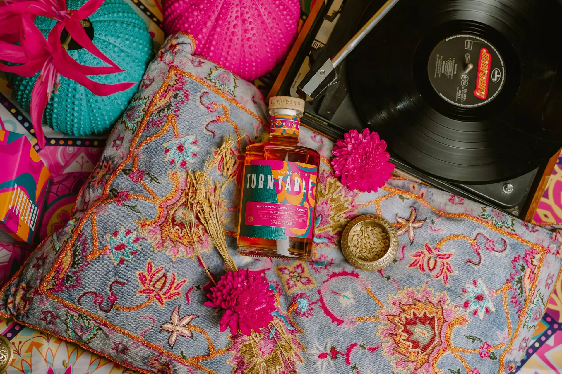
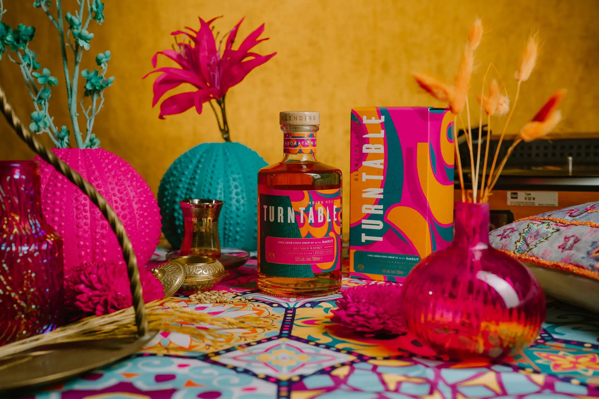
That doesn’t mean every whisky suddenly needs a neon label. In fact, I think a bottle shouldn’t shout too loudly. That’s when you can feel a marketing team straining to make “something for the kids.”
Just make a bottle appealing, but balanced. Give it a clear name, a strong typeface, and a design that says something about where the whisky comes from. Choose a handsome label with a distinctive color without going too bland.
Above all, make it look good on the shelf.
Read also
Whisky lovers could loosen up a little too
It’s not just the bottle that could stand to be looser and more modern. Enthusiasts can broaden their horizons too. Let go of the eternal “it has to be a single malt” and “it needs an age statement.” Try a blend, wander beyond Scotland, pick up a whisky without “12 years” on the label.
Embrace change, even if that means your cabinet ends up with sleeker bottles. If sustainability prompts brands to take a hard look at their bottles and packaging, that strikes me as entirely positive. Especially when the result is recognizable, attractive, and more up to date.
Glenfiddich shows that clean and familiar go hand in hand. Highland Park proves you can express a whisky’s origins without Viking motifs. As long as the whisky itself doesn’t suddenly become unrecognizable.
loading
POPULAR NEWS

The 10 whisky brands connoisseurs admire most

Bowmore's new whisky tastes like charred mango, says the distillery

The best whiskies from all of Speyside: these are the ones to pour this year

You’ll never drink whisky the same way after trying these chocolate pairings

Scottish community distillery sounds the alarm as whisky industry downturn bites

A brand new Ardbeg is coming and the current whiskies are getting a new look

Laphroaig honors its savior with an extraordinarily old and rare whisky
Indian ban forces sudden recipe change for a popular Diageo whisky
This might be the secret behind Indias rapid whisky rise

Whisky Names Explained: Highland Park Dragon Legend
LATEST COMMENTS
- Thank you for the compliment. I really appreciate it.M0nkey31-08-2026
- I enjoyed reading the different approaches to building a whisky collection. Whether you collect by region, style, or limited releases, discovering new brands keeps the hobby interesting. Soorahi is another premium whisky worth considering for collectors looking to explore the evolving world of quality whiskies.dinesh04-08-2026
- There is no distillery equipment there and also no licences to produce or sell alcohol.TRC19-12-2025
- Hi Yvonne, Thank you for your response and for sharing the video. Unfortunately, the evidence you referred to consists only of two people talking about the whisky, without any explanation or identification. We have not spoken to the individuals in the video ourselves, nor can we verify who they are. We describe it as a Chinese whisky because it is released by a Chinese distillery. As you mentioned, the distillery has chosen to label the product as “pure malt” instead of “Chinese whisky.” Based on that, we do not believe they are doing anything illegal.M0nkey16-11-2025
- So - you have the proof......where's your write up?Yvonne16-11-2025
- You are absolutely right. Luckily that doesn't matter for the taste of the whisky. Have you tried it yet?M0nkey05-11-2025
- Guess what? Finland is not part of Scandinavia.Gray105-11-2025
- Throw in the towel? You mean restructure to compete and win in a challenging industry environment.WestwardFounder21-10-2025
- There is nothing legally to prevent the English whisky GI from coming into force, it complies with all the relevant laws and the single malt definition follows the precedent of Welsh whisky and US whiskyChefBear15-10-2025
- Three emails sent (two with videos, linked to a Google Drive Share). 1. The original video. 2. The video with subtitles as it was shared on YouTube 3. Screen grab of the YouTube channel where the video was blocked due to Pernod Ricard lobbying. The story was covered on Drinks Intel at the time - link here - https://drinks-intel.com/subscriber-news/pernod-ricards-the-chuan-pure-malt-whisky-not-sourced-solely-from-china-global-drinks-intel-exclusive/Yvonne10-10-2025
Loading