Never miss whisky news, reviews, and new releases again.
Add Whisky Monkeys as a Google favoriteJohnnie Walker might just be the most recognizable whisky brand worldwide. Almost everyone has seen the name flash before their eyes and the logo of Johnnie Walker undeniably boasts the most iconic 'mascot' in the world of whisky. The following is how the famous logo came about.
FAQ
- Where was Johnnie Walker founded?
In Kilmarock, Scotland. - Who made the first bottles of Johnnie Walker?
John Walker. - What kind of whisky is Johnnie Walker?
A blended whisky.
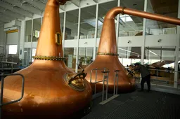
Johnnie Walker didn't casually become one of the most renowned beverages globally. The first whisky was already being brewed in 1820 in Kilmarnock, Scotland by the very man whose name now graces the label. In those days, however, there was no striding gentleman on the bottle. In fact, the first label only came later in 1865.
Bottles in that era were released with a gold-toned label, proudly displaying the phrase Old Highland Whisky in a Gothic font. Below this, it was clearly stated that the whisky was produced by John Walker and sons in Kilmarnock.
The first Striding Man
As Johnnie Walker started to grow, it was time to distinguish the whisky from the rest. In 1908, a logo was designed by Tom Browne: a cartoonish striding gentleman. Many features we still recognize in the logo were already presented in the original, like the top hat, the tailcoat, and the walking cane.
But the hand-drawn logo of 1908 was significantly more detailed. The gentleman on the bottle sauntered about with a pince-nez and clearly relished the stroll. A broad smile could be seen on the face of the Striding Man, who would be later known by that moniker.
Color in life
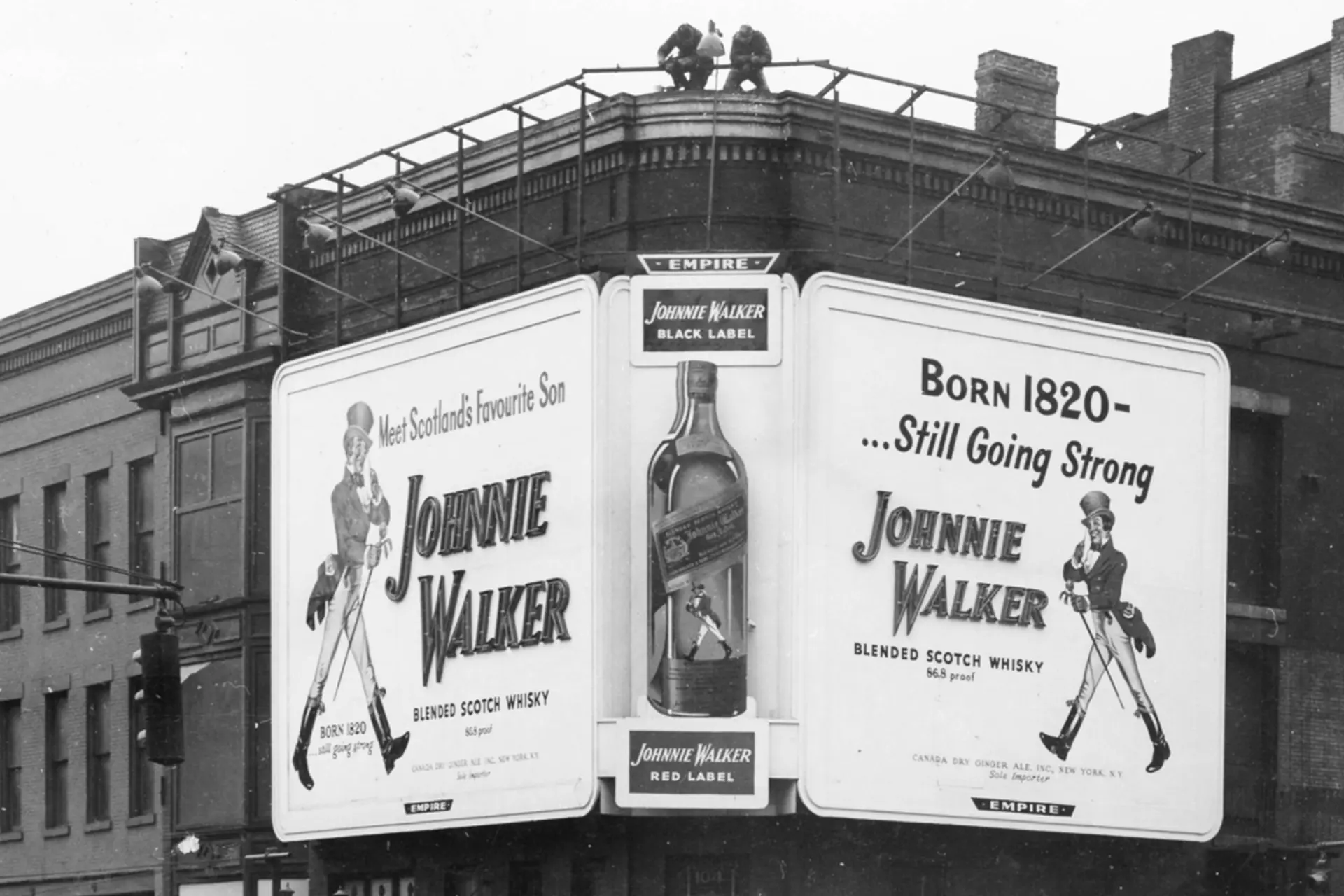
More than twenty years later, it was time for an update of the Johnnie Walker logo. In 1929, the new Striding Man was unveiled, and this time in full color. The previously black and white gentleman now wore a bright red coat, paired with a cream-colored trouser and a golden hat.
But it's not merely the addition of color; the gentleman appears distinctly younger and more details are discernible in the image. Visible are the creases in his trousers and the boots now have a beautiful shine.
A minimalist logo
The colorful logo of Johnnie Walker was used for a long time. It wasn't until 1996, nearly seventy years after the introduction of the second version, that it was time for a new logo. And this was the biggest makeover yet.
From a highly detailed Striding Man in color, it was decided to completely shift gears. The logo reverted to black and white, maintaining only the essential elements. The top hat, the jacket, the walking stick, and the boots could still be seen. What's more, negative space was used for the first time, and extensively so.
This minimalist logo was updated again in 2015, to the current version of the Striding Man. Nowadays, more details have been incorporated into the logo, presenting a face for the gentleman, a subtle tip of the top hat, and folds in the jacket and trousers. Still, the use of negative spaces and strictly black-and-white colors persists, making the modern logo a perfect compromise between old and new styles.
loading
POPULAR NEWS
Whisky import duty halved overnight in deal with a major whisky nation
Clonakilty shuffles mythology and whiskey in a new limited collection
This new Islay release might just set Kilchoman fans abuzz
This iconic Scotch whisky has a whole new look
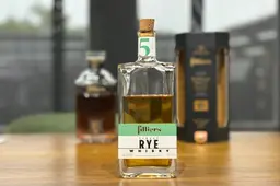
Filliers 5-Year-Old Single Rye Whisky: Vanilla and Chocolate Notes
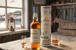
Oban Distillery unveils a whisky with a bottle that doubles as a hidden treasure map
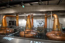
Teeling Whiskey Is No Longer Owned by the Teeling Family
This Japanese distillery started building the second location fo 'aging whisky very long'
This island distillery finally releases the whisky fans have waited 10 years for
'Bigger isn’t always better': Why LAGG Distillery is taking a different path
LATEST COMMENTS
- There is no distillery equipment there and also no licences to produce or sell alcohol.TRC19-12-2025
- Hi Yvonne, Thank you for your response and for sharing the video. Unfortunately, the evidence you referred to consists only of two people talking about the whisky, without any explanation or identification. We have not spoken to the individuals in the video ourselves, nor can we verify who they are. We describe it as a Chinese whisky because it is released by a Chinese distillery. As you mentioned, the distillery has chosen to label the product as “pure malt” instead of “Chinese whisky.” Based on that, we do not believe they are doing anything illegal.M0nkey16-11-2025
- So - you have the proof......where's your write up?Yvonne16-11-2025
- You are absolutely right. Luckily that doesn't matter for the taste of the whisky. Have you tried it yet?M0nkey05-11-2025
- Guess what? Finland is not part of Scandinavia.Gray105-11-2025
- Throw in the towel? You mean restructure to compete and win in a challenging industry environment.WestwardFounder21-10-2025
- There is nothing legally to prevent the English whisky GI from coming into force, it complies with all the relevant laws and the single malt definition follows the precedent of Welsh whisky and US whiskyChefBear15-10-2025
- Three emails sent (two with videos, linked to a Google Drive Share). 1. The original video. 2. The video with subtitles as it was shared on YouTube 3. Screen grab of the YouTube channel where the video was blocked due to Pernod Ricard lobbying. The story was covered on Drinks Intel at the time - link here - https://drinks-intel.com/subscriber-news/pernod-ricards-the-chuan-pure-malt-whisky-not-sourced-solely-from-china-global-drinks-intel-exclusive/Yvonne10-10-2025
- Hi Yvonne, Thank you for your interesting comment. Could you share your copy with us, so we can adjust our item accordingly? Mail us at [email protected]. Thank you in advance.M0nkey09-10-2025
- Let's keep this factually correct. Pernod Ricard DID NOT release a Chinese whisky. Their first output from The Chuan (the name of the distillery in Sichuan, China) wasn't fit for bottling. What they actually bottled was imported Scotch whisky. This is why the product is called "PURE MALT" and not "Chinese Whisky" - because Pure Malt is not a regulated term - this is not a secret. This was exposed about a week after they released it. There were even videos about their own staff on site admitting it was made from imported whisky - which Pernod Ricard got the lawyers onto to get the video pulled. I've got a copy if you want it.Yvonne09-10-2025
Loading